Photography Should Make an Impact
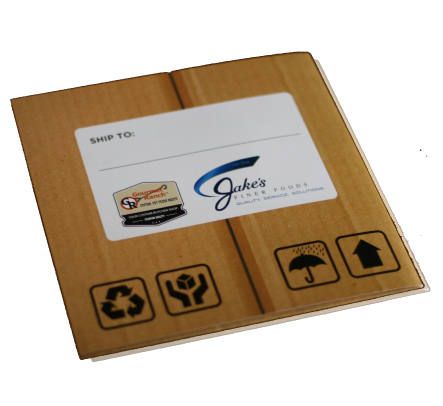
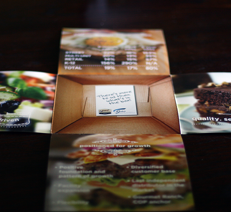
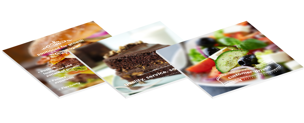
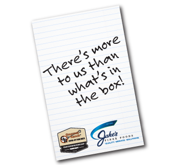
We used a mix of custom and stock photography to create the illusion of a box. Folded inside the panels of the box were mouthwatering shots of key food categories layered behind messaging. At the “bottom” of the box we created the look of a handwritten note from the company. There was depth, surprise, and detailed touches like shipping stamps and labels. The only thing missing was scratch ‘n sniff… (Next year!)
The Client Had An Idea
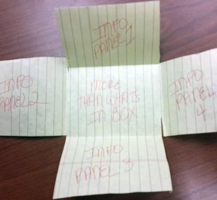
After consulting with the client on their needs for a brochure for a special event, we received a cell phone pic of this rough layout. It was enough to get us going.
We Turned It Into This
Looks like the inside of a box, yes? But it’s flat as a pancake, with a clever message that speaks volumes about Jake’s level of service and commitment to quality.
With Customer-Specific Add-Ons
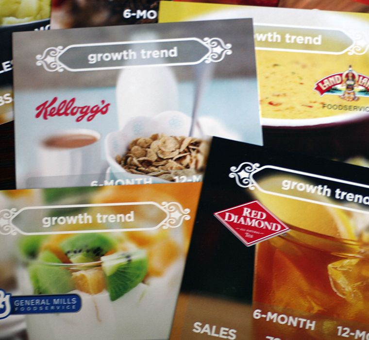
There were customized inserts for key customers that fit neatly inside the folded piece and illustrated the personal touch that Jake’s is known for.
And A Coordinated Follow-Up Piece
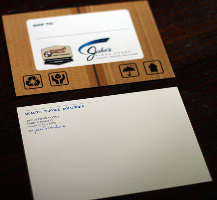
Finally, we created a quick matching postcard for the client to use for action item updates and follow-up notes to customers.
Print Design Should Make A Lasting Impression
And It Should Be …
Simply Beautiful
Strong Message
All the elements of this piece — from the photography chosen to the words on the page, the customized inserts, and the creative presentation — combined to send a strong, memorable brand message to every recipient. Which, of course, is the whole point.
Excellent Results
In the kind words of the client: “You are a rock star!!” Natalie Carter, Director of Marketing, Jake’s Finer Foods
